Cloudscape Design System
  • Get started
  • Foundation
  • Components
  • Patterns
  • Demos
  • GitHub 
Cloudscape Design System
  • Get started
  • Foundation
  • Components
  • Patterns
  • Demos
  • GitHub 
  • About

Components


  • Alert
  • Anchor navigation
  • App layout
  • App layout toolbar
  • Attribute editor
  • Autosuggest
  • Badge
  • Board components
    • Board
    • Board item
    • Items palette
  • Box
  • Breadcrumb group
  • Button
  • Button dropdown
  • Button group
  • Calendar
  • Cards
  • Charts
    • Bar chart
    • Line chart
    • Area chart
    • Mixed line and bar chart
    • Pie and donut charts
  • Checkbox
  • Code editor
  • Code view
  • Collection preferences
  • Collection select filter
  • Column layout
  • Container
  • Content layout
  • Copy to clipboard
  • Date input
  • Date picker
  • Date range picker
  • Drawer
  • Expandable section
  • File uploading components
    • File dropzone
    • File token group
    • File input
    • File upload
  • Flashbar
  • Form
  • Form field
  • Generative AI components
    • Avatar
    • Chat bubble
    • Loading bar
    • Prompt input
    • Support prompt group
  • Grid
  • Header
  • Help panel
  • Icon
  • Input
  • Key-value pairs
  • Link
  • Live region
  • Modal
  • Multiselect
  • Pagination
  • Popover
  • Progress bar
  • Property filter
  • Radio group
  • S3 resource selector
  • Segmented control
  • Select
  • Side navigation
  • Slider
  • Space between
  • Spinner
  • Split panel
  • Status indicator
  • Steps
  • Table
  • Tabs
  • Tag editor
  • Text content
  • Text filter
  • Text area
  • Tiles
  • Time input
  • Toggle
  • Toggle button
  • Token group
  • Top navigation
  • Tutorial components
    • Annotation context
    • Hotspot
    • Tutorial panel
  • Wizard
  1. Cloudscape Design System
    • Components
    • Board components
    1. Cloudscape Design System
    2. Components
    3. Board components

    Board components

    Made up of three components that work together to allow users to interact with, move, and configure a board layout.

    Published: March 10, 2023
    Configurable dashboard demo

    On this page

    1. Related components
    2. Guidance on creating a configurable dashboard
    3. How components work together

    Did this page help you?

    Tell us more - optional

    1000 character(s) available. Do not disclose any personal, commercially sensitive, or confidential information.

    Related components

    Board

    Provides the base for a configurable layout, including drag and drop, responsiveness and grid.

    Board item

    A board item is a self-contained user interface (UI) element living within a board.

    Items palette

    Provides the ability to add board items to a board layout when combined with discreet split panel.

    Guidance on creating a configurable dashboard

    For information about how to design and build a configurable dashboard experience using board components, see Service dashboard, Configurable dashboard and Dashboard items patterns.

    How components work together

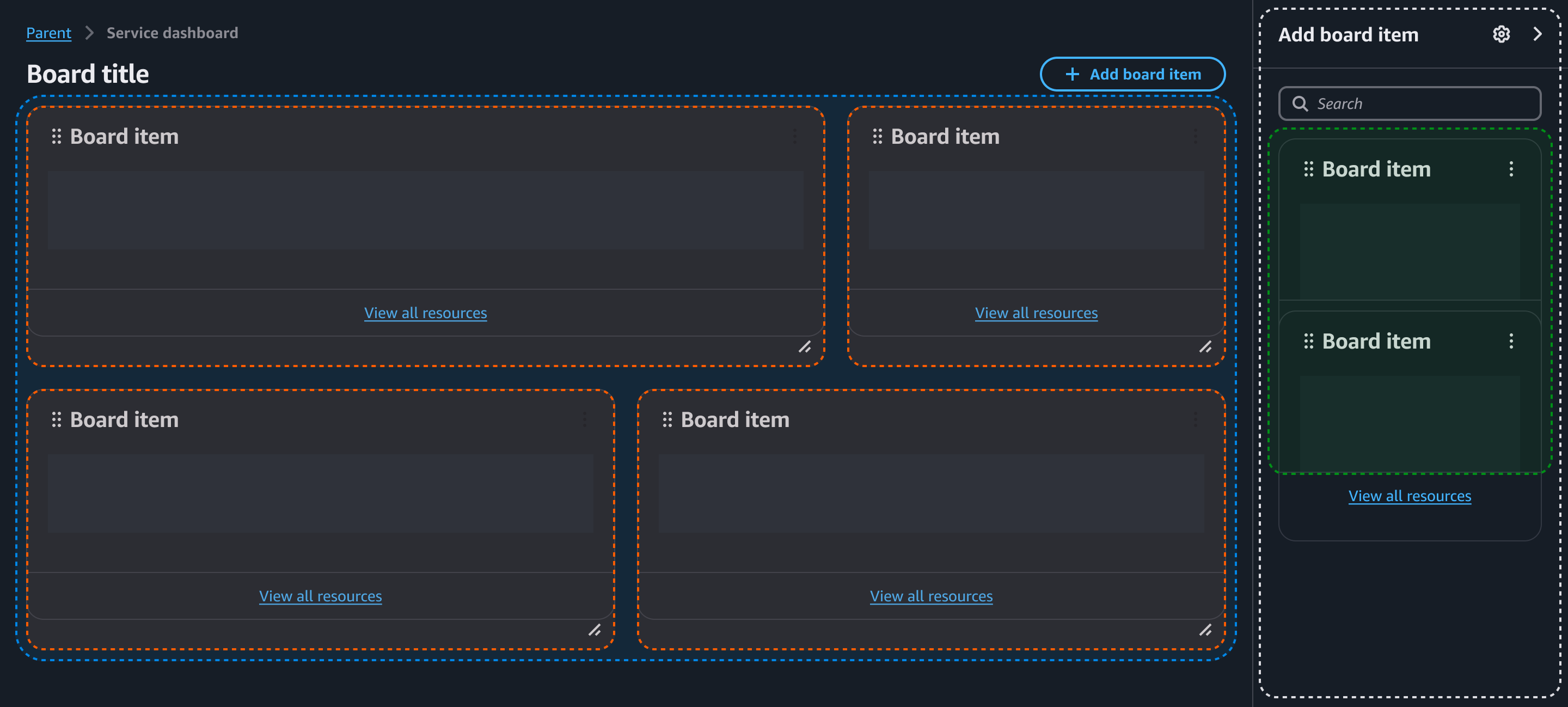
    Configurable dashboard pattern consists of three components, board, board item and items palette.

    Essentially, this pattern is a board component that contains board items within it. Individual board item components should be used for each content type you want to display on the board. These board item components are configurable (resizable and draggable).

    The items palette component provides the ability to add new content types to the board via drag-and-drop. Items palette content should also be featured in the board item component. For the best experience, we recommend using the split panel component, in discreet mode.

    For an example of a configurable dashboard built using board items, see this demo.

    How the components work together. Board item inside a board, followed by a item palette inside a discreet split panelHow the components work together. Board item inside a board, followed by a item palette inside a discreet split panel

    Did this page help you?

    Tell us more - optional

    1000 character(s) available. Do not disclose any personal, commercially sensitive, or confidential information.
    • About
    • Connect
    • Privacy 
    • Site terms 
    • © 2025, Amazon Web Services, Inc. or its affiliates. All rights reserved.
    Made with love atAWS