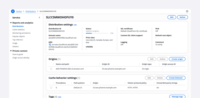
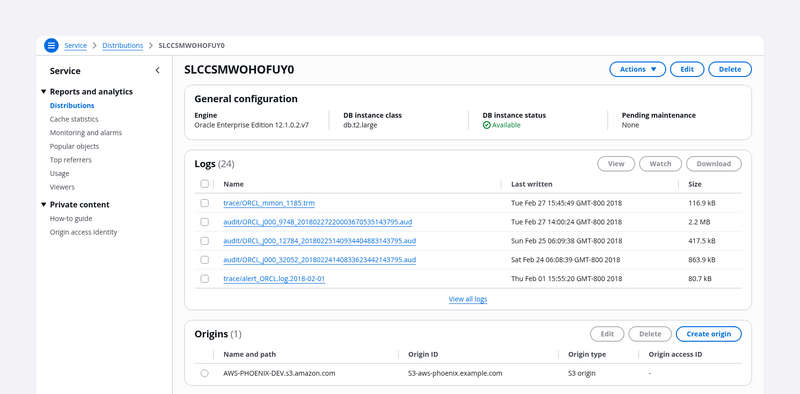
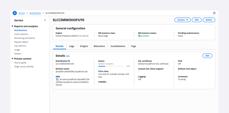
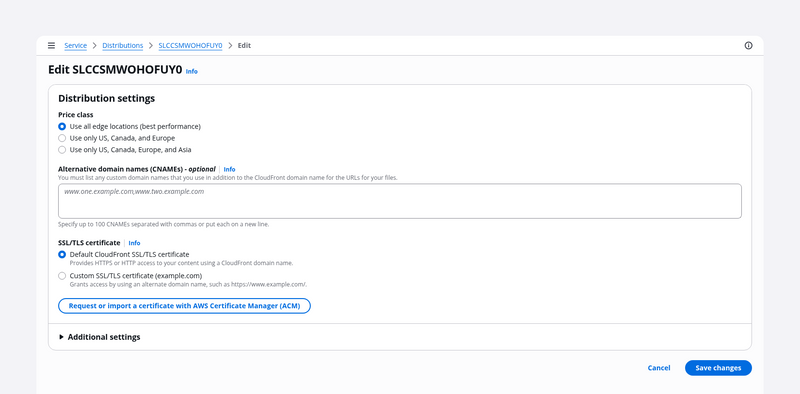
Demos
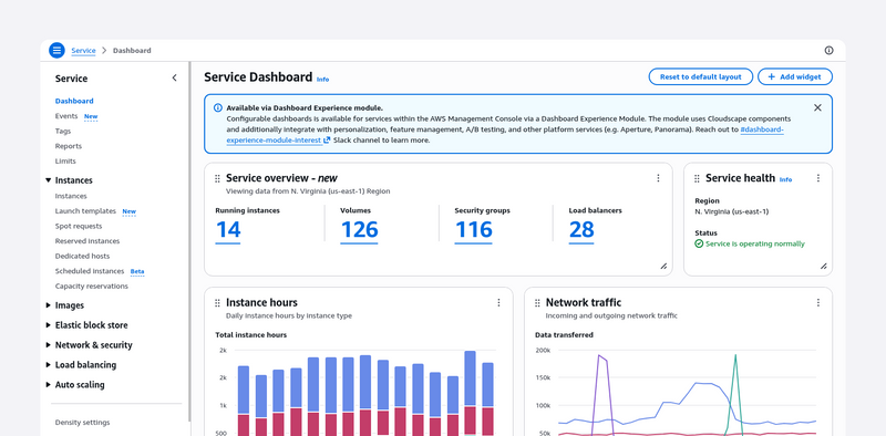
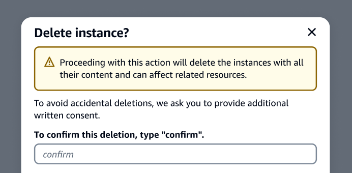
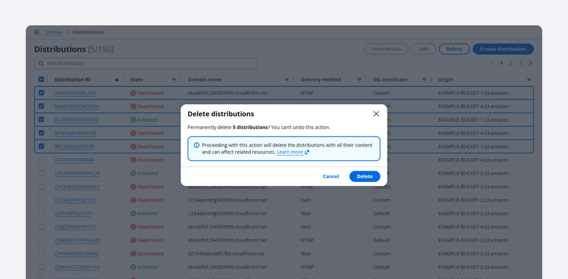
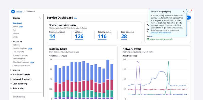
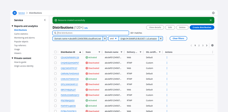
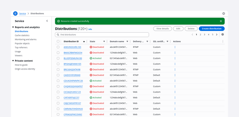
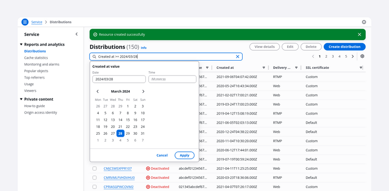
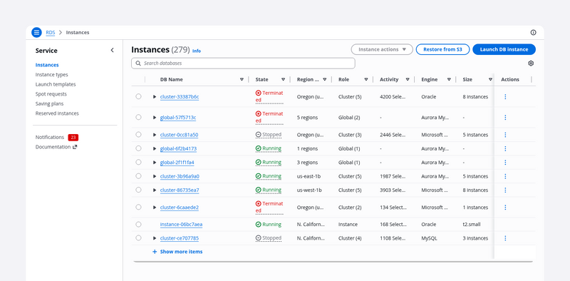
A demo is an example of a layout template using components. Use our demos to get a feel for the system, and see what services built with Cloudscape look like. Each demo opens in a new tab.
Demos (27)


A collection of resources represented as cards. It’s effective for glancing at small sets of similar resources with text, numerical, and imagery data sets.


An example of a form that prompts users with a confirmation modal when users leave the page with unsaved changes.


The delete with additional confirmation pattern helps prevent users from performing accidental, high-severity deletions by adding friction during the deletion process.


Provide a layer of confirmation before deleting resources that cannot be easily recreated.


The density settings pattern uses local storage to remember the user's preferred density setting. This pattern is for switching between comfortable and compact mode at the service level.


On a details page, users can view at a glance all the available information about a single resource.


With the details page as a hub pattern, users can view the details about a resource and a preview of related resources. Use the hub for resources that have large and complex data sets.


Users can use tabs to view the configuration details of a single resource on a single page. Users can choose each tab on the page to easily switch between different groupings of information in the same view.


Use the page edit pattern when you want users to manage a service resource by editing its properties and configuration in bulk.


Hands-on tutorials help users onboard onto flows and features in a service, by providing contextual suggestions at decision points in workflows.


Use the multipage create, which employs the wizard component, when you want users to create resources by completing a set of interrelated tasks. We recommend multipage create for long or complex configurations.


With the one-click delete pattern, users can quickly delete low-risk, non-critical resources.


A dashboard page presents at-a-glance information about service and resource status. Users can monitor this information and act upon it quickly.


Use single page create if you want your users to create a resource on a single page. This component is optimized for simple to medium-complex forms.


A collection of resources presented as table or cards and paired with a split panel for contextual resource details. It is effective for quickly browsing or comparing key resource details.


An example of comparing key resource details within the split panel on a split view.


A property filter lets users find specific items in a collection of resources by choosing properties, property values, typing free text and combining them with operators.


Variant of the table view for large data sets. Property filtering, pagination, and sorting are performed on the server-side, only the visible items are loaded on the client side.


The table view pattern is a collection of resources in a tabular format. It's effective for quickly identifying categories or comparing values in a large text and numerical data set.


Variant of the table view for large data sets. Filtering, pagination, and sorting are performed on the server-side, only the visible items are loaded on the client side.


A property filter supports custom property types, including dates, to employ convenient date/time inputs when defining filtering queries against date fields.


A select filter lets users find specific items in a collection of resources by choosing one or two properties.


The top navigation, when paired with side navigation and breadcrumbs, forms a global, scalable navigation system