Cloudscape Design System
  • Get started
  • Foundation
  • Components
  • Patterns
  • Demos
  • GitHub 
Cloudscape Design System
  • Get started
  • Foundation
  • Components
  • Patterns
  • Demos
  • GitHub 
  • About

Components


  • Alert
  • Anchor navigation
  • App layout
  • App layout toolbar
  • Attribute editor
  • Autosuggest
  • Badge
  • Board components
    • Board
    • Board item
    • Items palette
  • Box
  • Breadcrumb group
  • Button
  • Button dropdown
  • Button group
  • Calendar
  • Cards
  • Charts
    • Cartesian charts
    • Pie and donut charts
  • Charts (Legacy)
    • Bar chart
    • Line chart
    • Area chart
    • Mixed line and bar chart
    • Pie and donut charts
  • Checkbox
  • Code editor
  • Code view
  • Collection preferences
  • Collection select filter
  • Column layout
  • Container
  • Content layout
  • Copy to clipboard
  • Date input
  • Date picker
  • Date range picker
  • Drawer
  • Expandable section
  • File uploading components
    • File dropzone
    • File token group
    • File input
    • File upload
  • Flashbar
  • Form
  • Form field
  • Generative AI components
    • Avatar
    • Chat bubble
    • Loading bar
    • Prompt input
    • Support prompt group
  • Grid
  • Header
  • Help panel
  • Icon
  • Input
  • Key-value pairs
  • Link
  • List
  • Live region
  • Modal
  • Multiselect
  • Pagination
  • Popover
  • Progress bar
  • Property filter
  • Radio group
  • S3 resource selector
  • Segmented control
  • Select
  • Side navigation
  • Slider
  • Space between
  • Spinner
  • Split panel
  • Status indicator
  • Steps
  • Table
  • Tabs
  • Tag editor
  • Text content
  • Text filter
  • Text area
  • Tiles
  • Time input
  • Toggle
  • Toggle button
  • Token group
  • Top navigation
  • Tree view
  • Tutorial components
    • Annotation context
    • Hotspot
    • Tutorial panel
  • Wizard
  1. Cloudscape Design System
    • Components
    • Charts
    1. Cloudscape Design System
    2. Components
    3. Charts

    Charts

    Charts are a graphic representation of information and quantitative data, built on the Highcharts library, designed to provide a clear and interactive way to convey meaning.

    Published: September 11, 2025 | Last updated: September 9, 2025

    On this page

    1. Overview
    2. An introduction to data visualization
    3. Migration from legacy to new charts
    4. Chart types
    5. Related patterns
    6. Licensing

    Did this page help you?

    Tell us more - optional

    1000 character(s) available. Do not disclose any personal, commercially sensitive, or confidential information.

    Overview

    These include cartesian charts which makes up line, bar, mixed, scatter, area, and pie and donut charts. The components are a wrapper around the Highcharts charting library. It offers a scalable and flexible foundation that meets our high standards for accessibility, styles, and internationalization.

    An introduction to data visualization

    To get started using charts to visualize data, see the data visualization foundation article and data visualization color guidance.

    Migration from legacy to new charts

    For guidance on migrating from legacy to the new charts, refer to the migration guide, which includes configuration examples and code snippets.

    Chart types

    When using data visualization patterns to present data, choose the chart type that best shows the relationship between the data series. There are two chart components:

    Cartesian charts

    These use two axes to show data and help users see patterns or compare values.

    • Line chart: Visualizes one or many series of data, with an emphasis on how the data changes over time.

    • Bar chart: Visualizes one or many series of data, with an emphasis on the total amount of each data point.

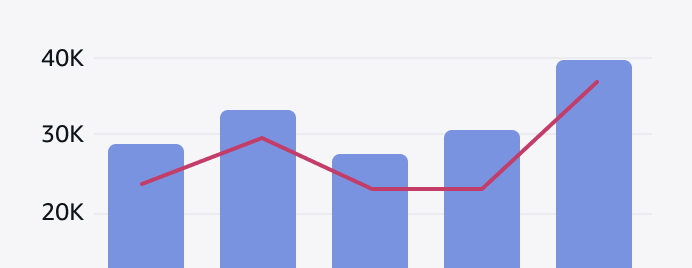
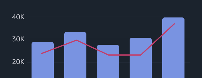
    • Mixed chart: Visualizes different, but related, series of data on a single chart.

    • Scatter chart: Visualizes the relationships between data in two dimensions.

    • Area chart: The area chart visualizes two or more series of data. Through stacked data series, it emphasizes the part-to-whole relationship of data over a period of time.

    Pie and donut charts

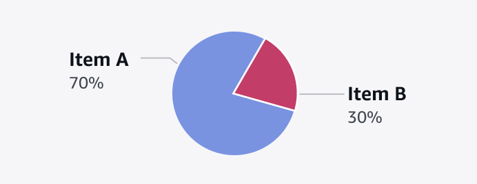
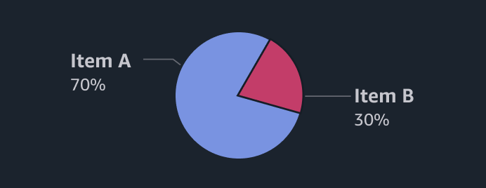
    Pie and donut charts display portions of a whole unit so users can compare data points from a total set. A donut chart also includes a summary metric in the center of the chart.

    • Pie chart: A pie chart helps users see the relationship between different data metrics in a data set.

    • Donut chart: A donut chart is a variant of a pie chart with its center removed.

    Related patterns

    Cartesian charts

    Cartesian charts display information along horizontal and vertical axes to clearly show patterns, comparisons, and relationships between values. It includes line, bar, area, scatter, and mixed charts.

    Pie and donut charts

    Pie and donut charts visualize the relationship or correlation between data metrics in a dataset.

    Data visualization colors

    Color can be used as a powerful element to augment a chart or other data visualization when applied with a clear sense of purpose. 

    Data visualization

    Data visualization is a graphic representation of information and quantitative data intended to quickly and clearly convey meaning.

    Licensing

    These new chart components require appropriate Highcharts licenses. Cloudscape is not responsible for improper usage of these Highcharts-based components or lack of license coverage. To learn more about the licensing model of Highcharts, review their license offering  and FAQ , or contact them directly.

    Did this page help you?

    Tell us more - optional

    1000 character(s) available. Do not disclose any personal, commercially sensitive, or confidential information.
    • About
    • Connect
    • Privacy 
    • Site terms 
    • © 2025, Amazon Web Services, Inc. or its affiliates. All rights reserved.
    Made with love atAWS