Artifact previews
How to display AI-generated artifacts in generative AI chat.
How to display AI-generated artifacts in generative AI chat.
Artifacts are AI-generated outputs such as documents, images, code, workflows. These artifacts are rendered as previews that typically contain a label and description, with metadata and related actions.
You can display generated artifacts in two ways within the chat experience, each serving different user needs and interaction models:
Inline previews: These previews emphasize quick understanding and enable contextual interactions such as download or copy within the chat interface.
Canvas previews: These previews display in the chat and expand to show the full artifact in an adjacent area where users can view and interact with the content.
Inline previews | Canvas previews | |
|---|---|---|
Artifact complexity | Simple, self-contained content. For example, a .csv generated by AI that can be downloaded. | Complex, interactive content that a user can modulate. For example, canvases generated by AI containing forms or wizards. |
Content length | Short. For example, a code snippet for a CLI command. | Long. For example, a dense document written by AI. |
Primary user intent | Quick recognition and basic actions. | Detailed review, editing, or interaction. |
Key actions | Quick actions. For example, download, copy, share. | Complex actions. For example, edit, annotate, or completing a task or workflow. |
Interaction depth | Minimal. Users can act on the artifact without opening it. | Complex. Users need to explore or work within the content. |
Conversation flow | Maintaining flow of the conversation is critical. | Artifact becomes the primary focus. |
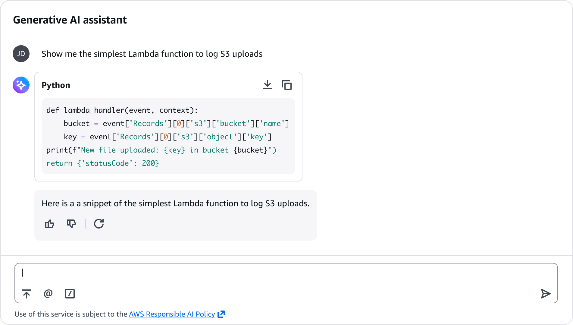
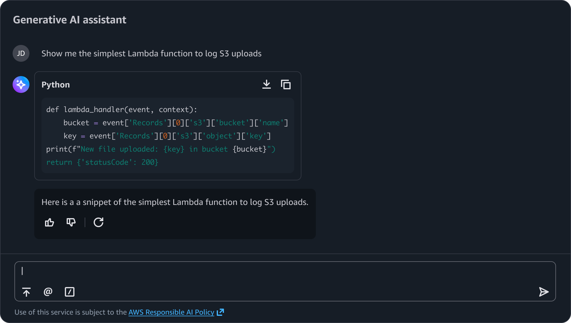
Short blocks displayed directly in the conversation with syntax highlighting, language indicator, and copy action. Ideal for quick reference, examples, or snippets users can immediately copy and paste.
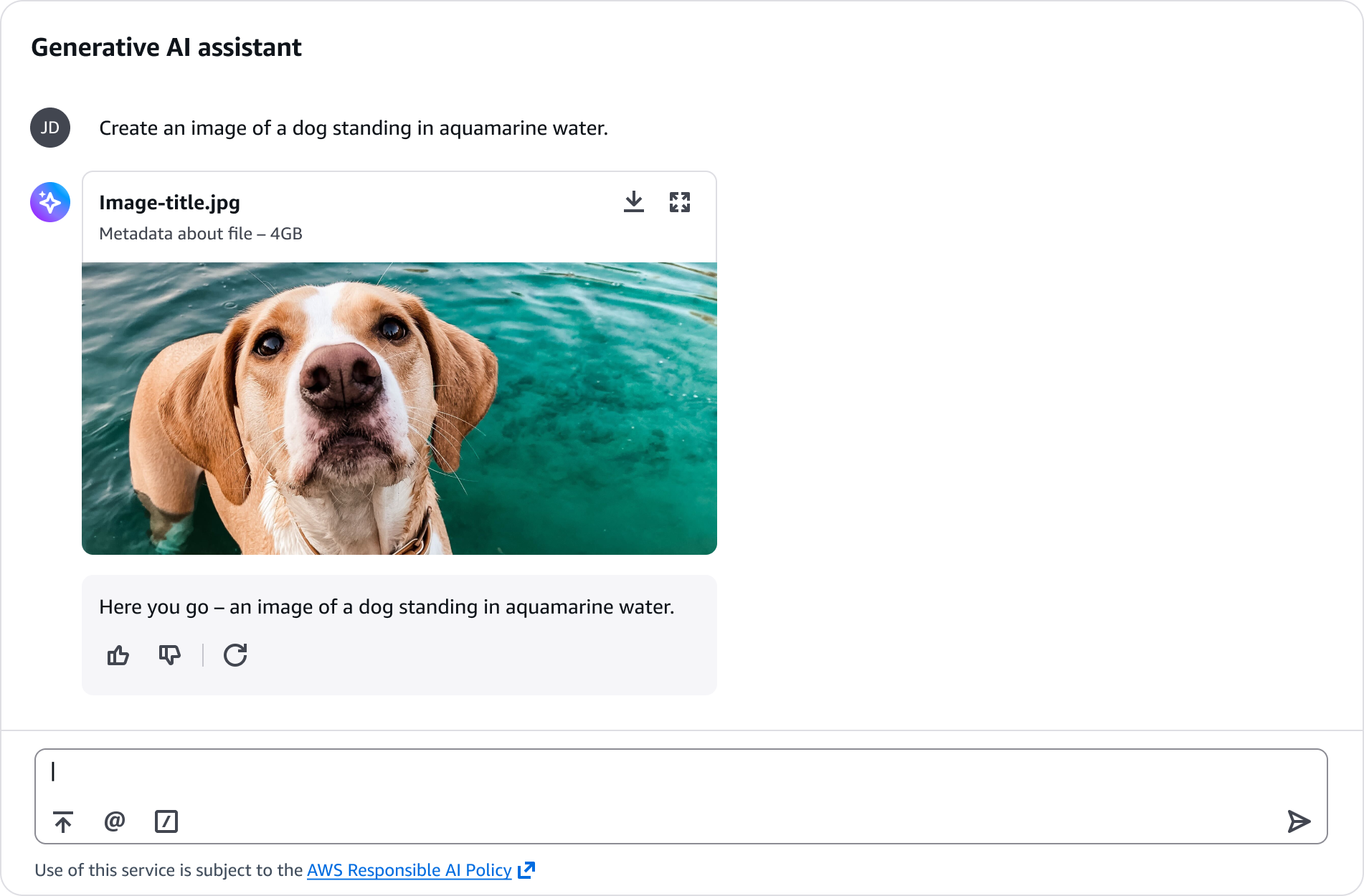
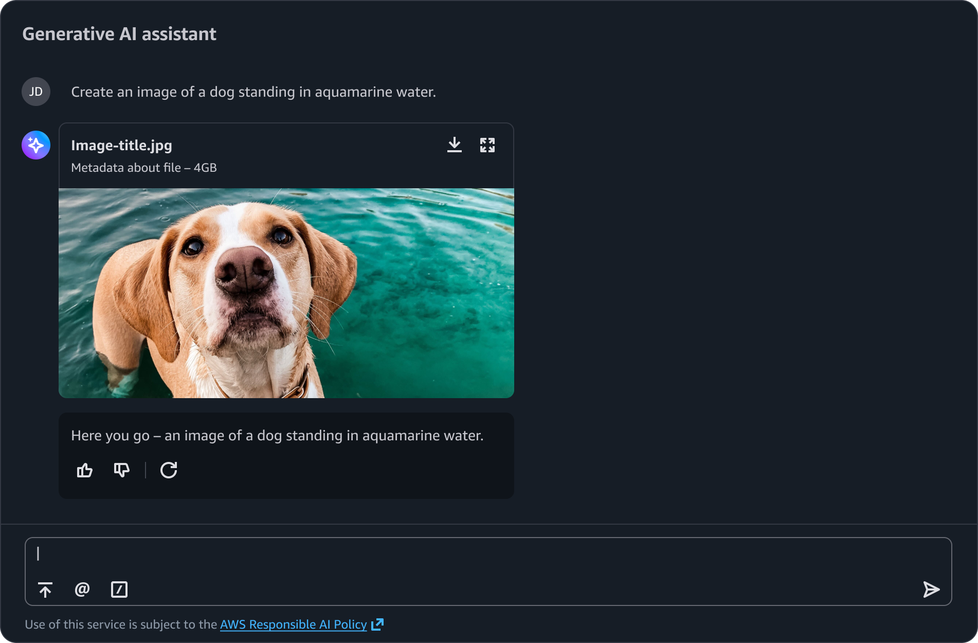
Generated media such as images, charts, diagrams, or videos display with inline previews that include file names, metadata, and actions for downloading or expanding. This allows users to immediately view and assess visual content without requiring them to be opened in a separate viewer. For expanding a generated artifact such as an image, follow the guidance for image magnifier.
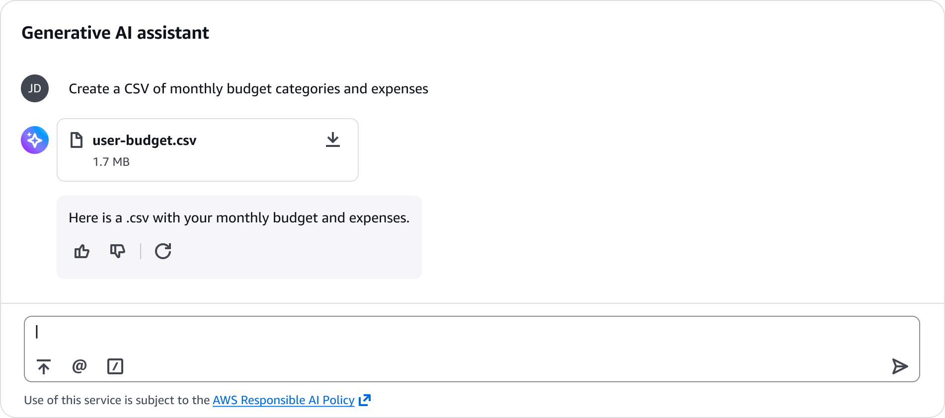
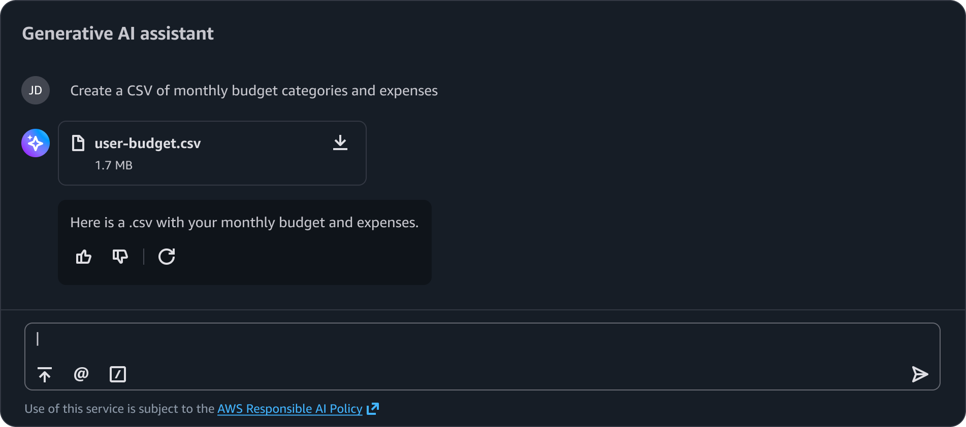
Documents and generated files display as downloadable artifacts with file names, size metadata, and download actions. This format works for well any files that users need to save locally without opening or viewing them first.
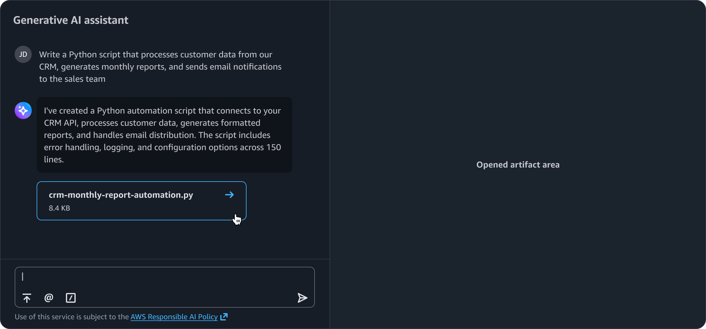
Artifact previews allow users to interact with generated content and progressively render the full artifact in an adjacent panel. For example, when a user selects an AI-generated document artifact preview, its contents display in the side panel. Use when users need to preview or read through content as the primary action without requiring secondary actions such as download or share.
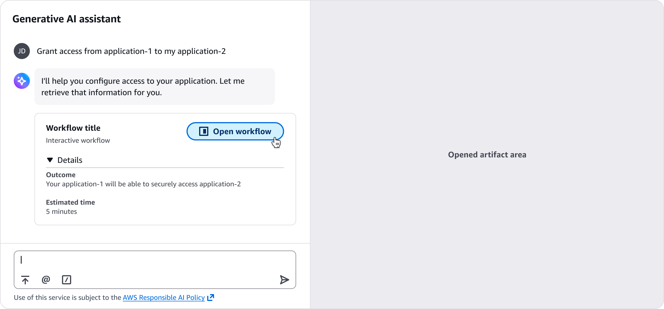
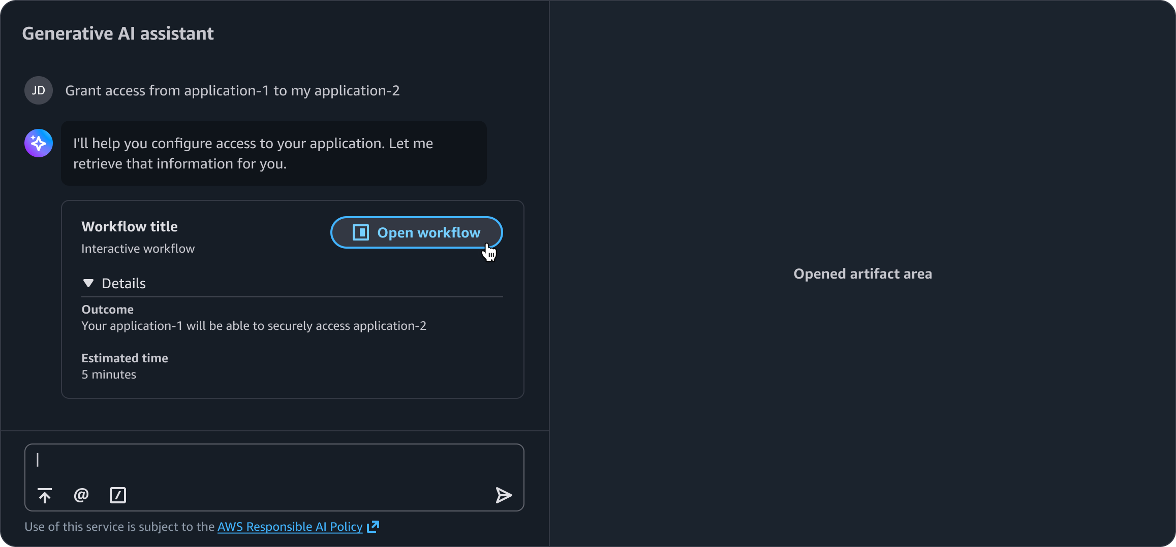
Artifact previews with additional metadata provide interactive elements for users to explore generated content. For example, an artifact preview includes an expandable section with workflow details. Users can open the full workflow in an adjacent panel by selecting an action button on the preview card.
Use sentence case, but continue to capitalize proper nouns and brand names correctly in context.
Use end punctuation, except in headers and buttons. Don’t use exclamation points.
Use present-tense verbs and active voice.
Don't use please, thank you, ellipsis (...), ampersand (&), e.g., i.e., or etc. in writing.
Avoid directional language.
For example: use previous not above, use following not below.
Use device-independent language.
For example: use choose or select not click.
Express the file size using standard units such as KB, MB, or GB.
Follow the guidelines on alternative text and Accessible Rich Internet Applications (ARIA) regions for each component.
Make sure to define ARIA labels aligned with the language context of your application.
Don't add unnecessary markup for roles and landmarks. Follow the guidelines for each component.
Provide keyboard functionality to all available content in a logical and predictable order. The flow of information should make sense.